
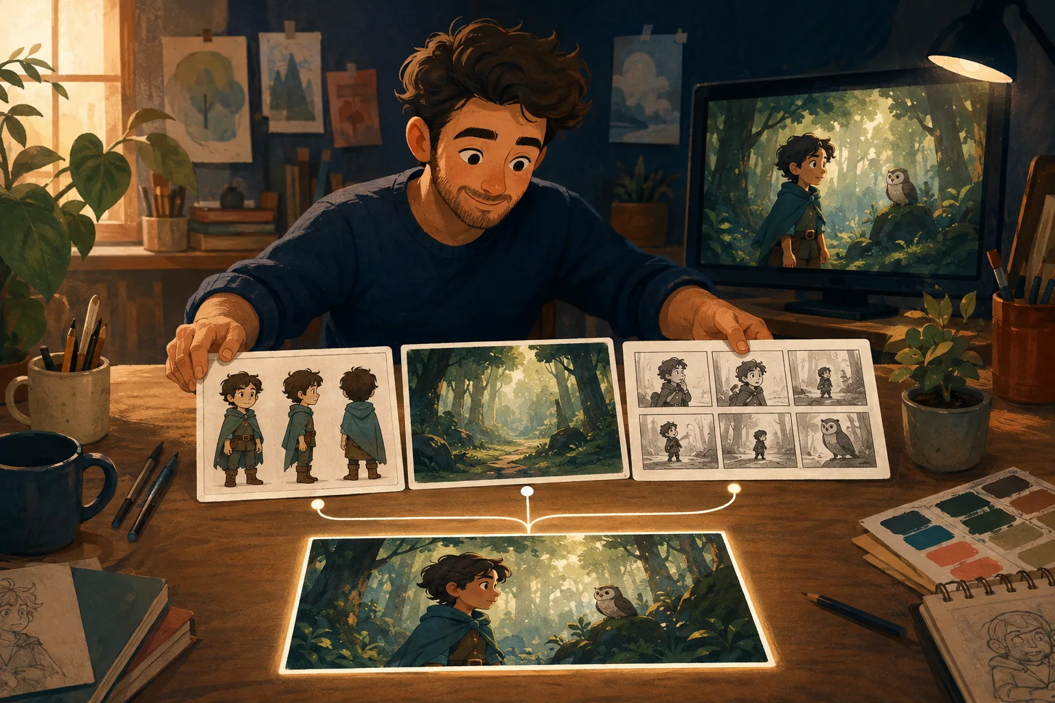
The best cartoon style is not automatically the most detailed one.
It is the style that fits the story and can survive the whole production.
A beautiful test image is easy to love.
The harder question is:
Will this still work across 20 scenes, different locations, close-ups, action and dialogue?
Start with the story
A gentle bedtime story and a fast comedy do not need the same visual language.
Ask:
- Is the story funny or serious?
- Warm or dramatic?
- Child-focused or adult?
- Personal or commercial?
- Quiet or action-heavy?
Style should support that feeling.
Think about the audience
A cartoon does not become childish simply because it is a cartoon.
But visual choices communicate expectations.
Bright exaggerated characters can feel playful.
Restrained shapes and natural lighting can feel more mature.
A business explainer may want approachable without looking like preschool content.
A child's birthday story may benefit from exactly that sense of playful exaggeration.
Compare styles using the same scene
Do not compare:
- one beautiful fantasy castle in 3D;
- one random office in flat 2D;
- one dramatic anime action shot.
The subject matter is doing half the persuasion.
Use the same character and same moment.
For example:
Girl standing beside a broken bicycle in a suburban garage.
Render that concept in several directions.
Now you can compare the style itself.
Evaluate character readability
Can you recognize the character:
- from a distance?
- in profile?
- in a close-up?
- in another outfit?
- under different lighting?
A strong production style supports the character instead of hiding them under detail.
Evaluate repeatability
If the cartoon has recurring characters, the style needs to remain reasonably stable across scenes.
Highly complicated textures, unusual materials or extreme stylization can create additional continuity pressure.
That does not mean "choose simple."
It means understand what you are choosing.
Think about the world
Some styles are excellent for faces but weak for environments.
Your cartoon may need:
- city streets;
- bedrooms;
- forests;
- spaceships;
- restaurants;
- branded offices.
Test a character and a location before locking the direction.
Create a small style guide
Once you choose, record the important rules.
For example:
Look: stylized 3D family animation.
Shapes: rounded, simplified.
Materials: soft, slightly matte.
Lighting: warm and cinematic, not glossy.
Color: saturated but not neon.
Faces: expressive eyes, readable mouth shapes.
Camera: cinematic but not extreme.
Now future scenes have a visual target.
Avoid accidental style drift
If one prompt says:
cinematic 3D cartoon
and the next says:
cute illustrated children's movie
and another says:
hyper-detailed animated feature
you are quietly changing the brief.
Keep the approved style language stable.
Change the scene, not the entire visual identity.
Where MyToonMaker fits
A guided cartoon workflow should help you choose the visual direction once and then build the production around that decision.
At publication time, replace this general bridge with the exact current style-selection behavior and real MyToonMaker comparison images.
Start Your Cartoon.